CLIENT:

Niskanen Center

SERVICES:

  • Editorial & Print Design
  • Graphic Design & Illustration
  • Creative Strategy
  • Data Visualization
  • Policy think tank builds a data visualization system to bring clarity and consistency to its research.

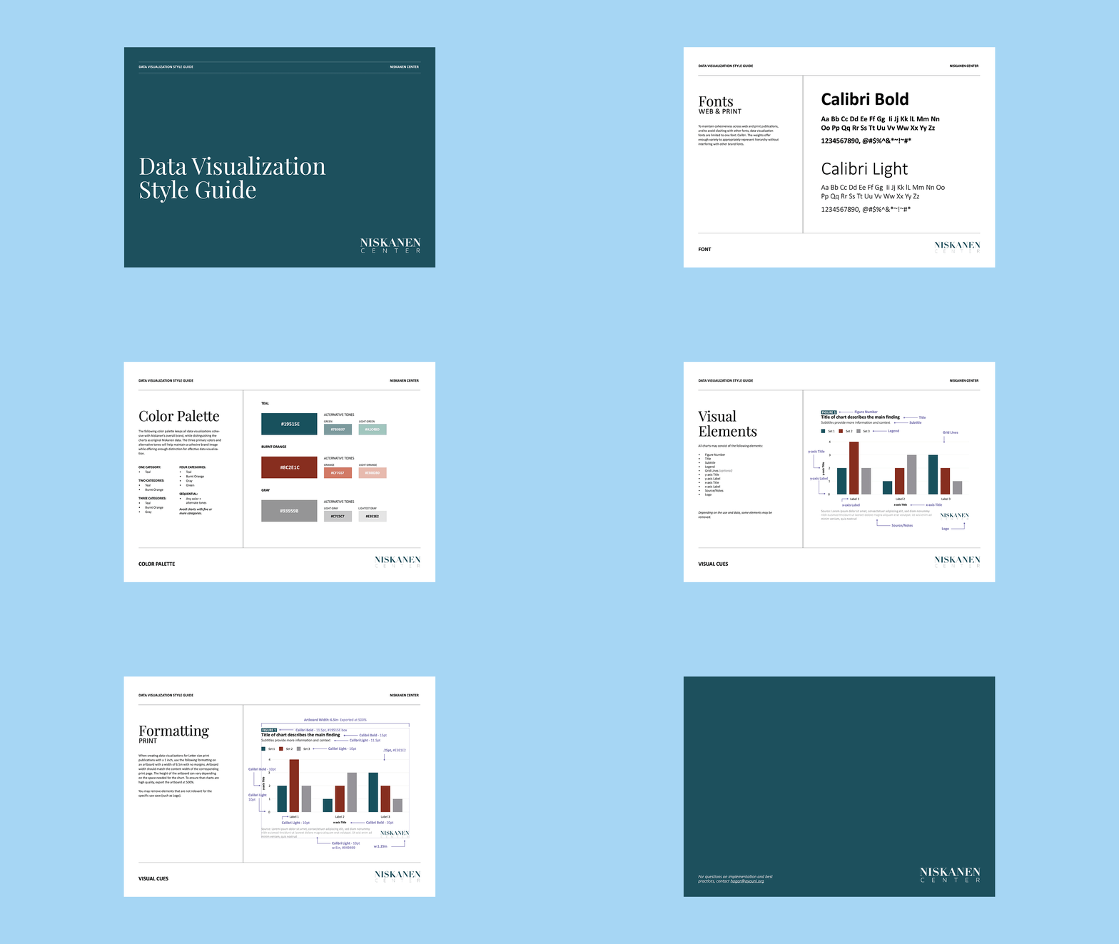
    Named “The Most Interesting Think Tank in American Politics” by TIME Magazine in 2023, Niskanen Center takes a distinctly independent approach to policy, drawing on ideas across the ideological spectrum to find common ground most think tanks aren’t built to find. That kind of work depends on data, and data sits at the center of almost everything they publish. Their team came to us needing a real system for how that data gets visualized, something that could hold up across print reports, the website, and social media. We built them a full data visualization style guide, then put it to work designing chart templates, social media carousels, and ongoing chart support for their reports and site.

    THE CHALLENGE:

    Niskanen’s charts were all being built in Excel by different people on different teams, and it showed. Fonts, colors, and sizing changed from chart to chart. Some images came out pixelated once they hit the web or got shared on social. For an organization whose credibility depends on meeting a broad range of audiences on their own terms, from journalists to policymakers across the ideological spectrum, inconsistent, unpolished visuals undercut the seriousness of the research itself. They needed a system, not just nicer charts.

    OUR APPROACH:

    We built a full data visualization style guide covering typography, a distinct three color palette (with tested combinations for one through four data categories), spacing, and formatting specs for web, print, and social media, right down to exact point sizes and artboard dimensions for each. Every element was designed to be simple enough for their team to replicate in Canva without a designer on hand for every chart.

    Once the style guide was in place, we put it to the test with a social media carousel unpacking a complex migration story: the surge of Chinese nationals traveling through Ecuador and the Darién Gap toward the U.S. southern border. The data spanned entry and departure records, border encounter trends across four countries, demographic breakdowns, and regional origin data within China itself, the kind of dense, multi-layered research that’s easy to visualize poorly. Using the new system, we turned it into a clean, scrollable sequence of maps, line charts, and stat call-outs that made a genuinely complicated trend easy to follow at a glance, without losing any of the nuance in Niskanen’s original analysis.

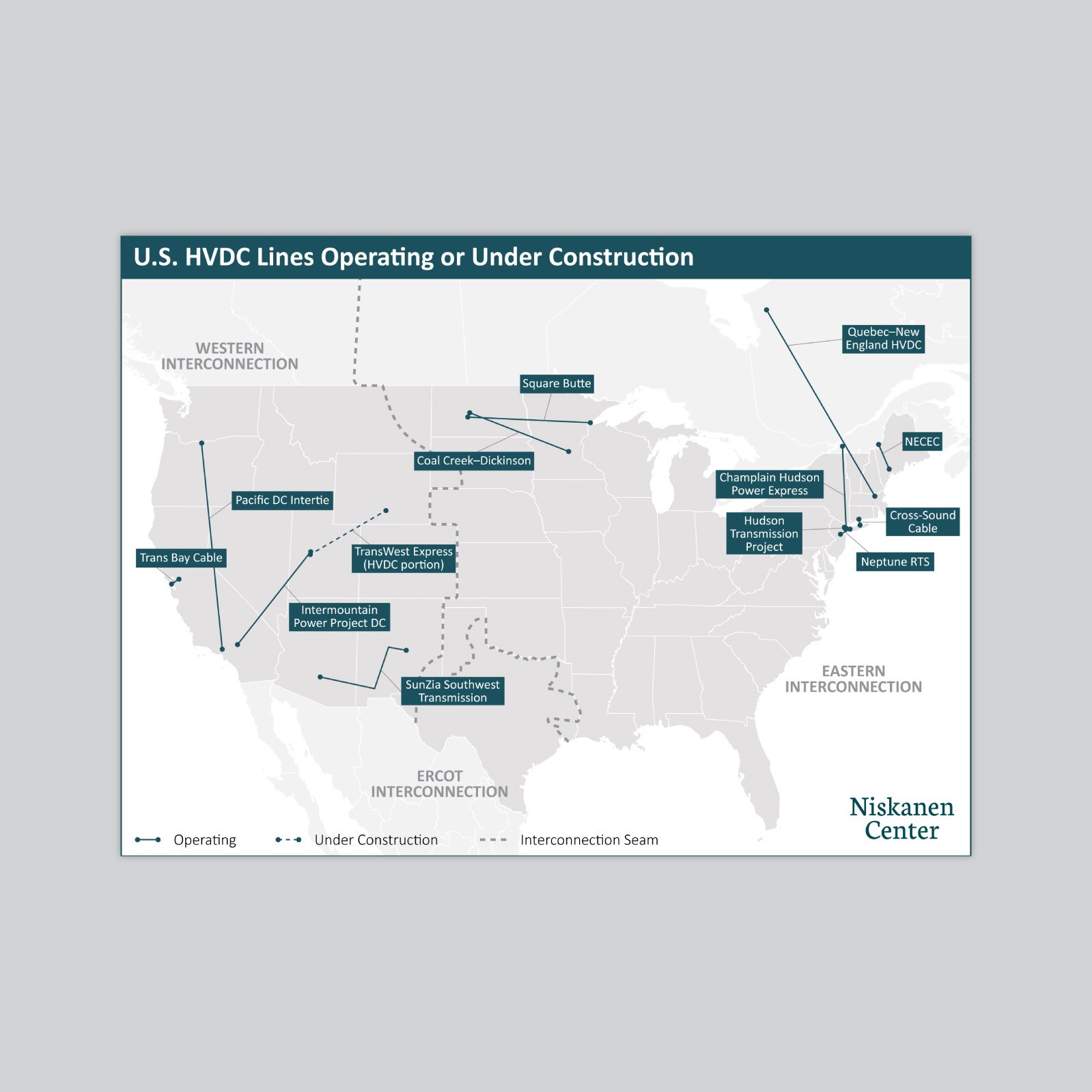
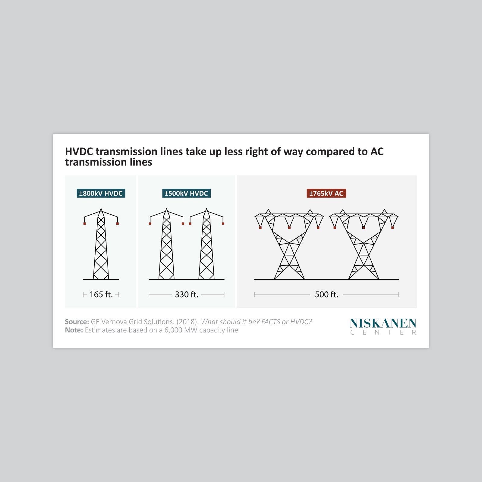
    The style guide became the standard Niskanen’s team builds from on an ongoing basis. We continue to work together to design custom charts and diagrams for their reports and website as new research comes out, covering everything from HVDC transmission infrastructure and AC versus DC power comparisons to state-by-state energy policy maps and emissions accounting models. Each one follows the same visual system, so regardless of topic or complexity, every chart looks like it belongs to the same organization.
    NC-5

    Have an idea for a project?